border-image-slice CSS property
Baseline
Widely available
This feature is well established and works across many devices and browser versions. It’s been available across browsers since July 2015.
The border-image-slice CSS property divides the image specified by border-image-source into regions. These regions form the components of an element's border image.
Try it
border-image-slice: 30;
border-image-slice: 30 fill;
border-image-slice: 44;
border-image: url("../../../../../../shared-assets/images/examples/border-florid.svg") round;
border-image-slice: calc(50 / 184 * 100%) calc(80 / 284 * 100%) fill;
border-image-width: 30px 48px;
<section id="default-example">
  <div id="example-element">This is a box with a border around it.</div>
</section>
#example-element {
  width: 80%;
  height: 80%;
  display: flex;
  align-items: center;
  justify-content: center;
  padding: 50px;
  background: #fff3d4;
  color: black;
  border: 30px solid;
  border-image: url("../../../../../../shared-assets/images/examples/border-diamonds.png") 30
    round;
  font-size: 1.2em;
}
Syntax
/* All sides */
border-image-slice: 30%;

/* top and bottom | left and right */
border-image-slice: 10% 30%;

/* top | left and right | bottom */
border-image-slice: 30 30% 45;

/* top | right | bottom | left */
border-image-slice: 7 12 14 5;

/* Using the `fill` keyword */
border-image-slice: 10% fill;
border-image-slice: fill 10%;

/* Global values */
border-image-slice: inherit;
border-image-slice: initial;
border-image-slice: revert;
border-image-slice: revert-layer;
border-image-slice: unset;
The border-image-slice property may be specified using one to four <number-percentage> values to represent the position of each image slice. Negative values are invalid; values greater than their corresponding dimension are clamped to 100%.
- When one position is specified, it creates all four slices at the same distance from their respective sides.
- When two positions are specified, the first value creates slices measured from the top and bottom, the second creates slices measured from the left and right.
- When three positions are specified, the first value creates a slice measured from the top, the second creates slices measured from the left and right, the third creates a slice measured from the bottom.
- When four positions are specified, they create slices measured from the top, right, bottom, and left in that order (clockwise).
The optional fill value, if used, can be placed anywhere in the declaration.
Values
<number>-
Represents an edge offset in pixels for raster images and coordinates for vector images. For vector images, the number is relative to the element's size, not the size of the source image, so percentages are generally preferable in these cases.
<percentage>-
Represents an edge offset as a percentage of the source image's size: the width of the image for horizontal offsets, the height for vertical offsets.
fill-
Preserves the middle image region and displays it like a background image, but stacked above the actual
background. Its width and height are sized to match the top and left image regions, respectively.
Description
The slicing process creates nine regions in total: four corners, four edges, and a middle region. Four slice lines, set a given distance from their respective sides, control the size of the regions.
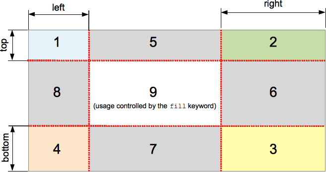
The above diagram illustrates the location of each region.
- Zones 1-4 are corner regions. Each one is used a single time to form the corners of the final border image.
- Zones 5-8 are edge regions. These are repeated, scaled, or otherwise modified in the final border image to match the dimensions of the element.
- Zone 9 is the middle region. It is discarded by default, but is used like a background image if the keyword
fillis set.
The border-image-repeat, border-image-width, and border-image-outset properties determine how these regions are used to form the final border image.
Formal definition
| Initial value | 100% |
|---|---|
| Applies to | all elements, except internal table elements when border-collapse is collapse. It also applies to ::first-letter. |
| Inherited | no |
| Percentages | refer to the size of the border image |
| Computed value | one to four percentage(s) (as specified) or absolute length(s), plus the keyword fill if specified |
| Animation type | by computed value type |
Formal syntax
border-image-slice =
  [ <number [0,∞]> | <percentage [0,∞]> ]{1,4}  &&
  fill?
Examples
Adjustable border width and slice
The following example shows a <div> with a border image set on it. The source image for the borders is as follows:

The diamonds are 30px across, so setting 30 pixels as the value for both border-width and border-image-slice will get you complete and fairly crisp diamonds in your border:
border-width: 30px;
border-image-slice: 30;
These are the default values we have used in this example. However, we have also provided two sliders to allow you to dynamically change the values of the above two properties, allowing you to appreciate the effect they have:
border-image-slice Changes the size of the image slice sampled for use in each border and border corner (and the content area, if the fill keyword is used) — varying this away from 30 causes the border to look somewhat irregular, but can have some interesting effects.
border-width: Changes the width of the border. The sampled image size is scaled to fit inside the border, which means that if the width is bigger than the slice, the image can start to look somewhat pixelated (unless of course you use an SVG image).
HTML
<div class="wrapper">
  <div></div>
</div>

<ul>
  <li>
    <label for="width">slide to adjust <code>border-width</code></label>
    <input type="range" min="10" max="45" id="width" />
    <output id="width-output">30px</output>
  </li>
  <li>
    <label for="slice">slide to adjust <code>border-image-slice</code></label>
    <input type="range" min="10" max="45" id="slice" />
    <output id="slice-output">30</output>
  </li>
</ul>
CSS
.wrapper {
  width: 400px;
  height: 300px;
}

div > div {
  width: 300px;
  height: 200px;
  border-width: 30px;
  border-style: solid;
  border-image: url("/shared-assets/images/examples/border-diamonds.png");
  border-image-slice: 30;
  border-image-repeat: round;
}

li {
  display: flex;
  place-content: center;
}
JavaScript
const widthSlider = document.getElementById("width");
const sliceSlider = document.getElementById("slice");
const widthOutput = document.getElementById("width-output");
const sliceOutput = document.getElementById("slice-output");
const divElem = document.querySelector("div > div");

widthSlider.addEventListener("input", () => {
  const newValue = `${widthSlider.value}px`;
  divElem.style.borderWidth = newValue;
  widthOutput.textContent = newValue;
});

sliceSlider.addEventListener("input", () => {
  const newValue = sliceSlider.value;
  divElem.style.borderImageSlice = newValue;
  sliceOutput.textContent = newValue;
});
Result
Specifications
| Specification |
|---|
| CSS Backgrounds and Borders Module Level 3 # border-image-slice |
Browser compatibility
| desktop | mobile | |||||||||||
|---|---|---|---|---|---|---|---|---|---|---|---|---|
border-image-slice
|
|
|
|
|
|
|
|
|
|
|
|
|
Legend
Tip: you can click/tap on a cell for more information.
- Full support
- Full support
- See implementation notes.
- Requires a vendor prefix or different name for use.
- Has more compatibility info.